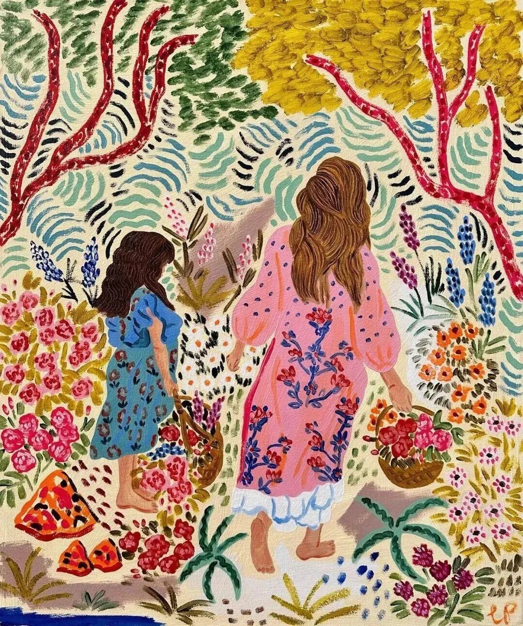
如果你见过卡米拉・帕金斯(Camilla Perkins)的画,一定会被那扑面而来的生命力所震撼:桃红撞碎靛蓝的寂静,柠黄点燃翠绿的呼吸,粗粝的笔触如风的指纹,将花卉、静物与日常瞬间,酿成一杯冒着气泡的夏日水果汽水。
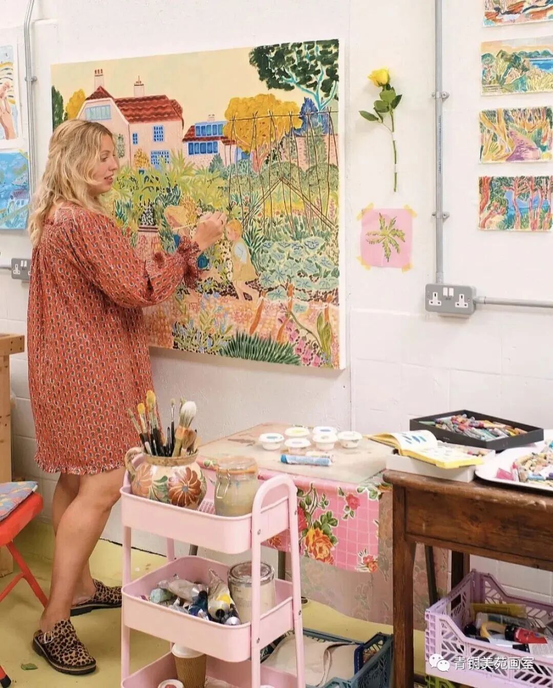

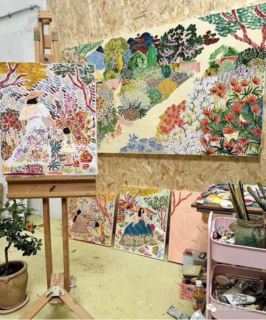
这位来自英国东苏塞克斯的插画师,用油画棒与马克笔的私语,打破了现实与梦境的边界,让每一幅作品都成为治愈心灵的彩色秘境。她的画作不仅是视觉的盛宴,更是一场关于色彩、热爱与生活的启蒙—— 告诉我们,世界本就该如此斑斓,画画本就该如此快乐。
01 艺术溯源:东苏塞克斯的风,吹来了色彩的灵感

卡米拉・帕金斯的艺术基因,深深扎根于英国东苏塞克斯的土地。这座位于英格兰东南部的历史郡,有着绵延的海岸线、丰饶的田园与永不褪色的雨季,海洋的咸湿、花园的芬芳与乡村的静谧,是她取之不尽的灵感宝库。
卡米拉的艺术觉醒,始于童年一次美术馆的邂逅。当她还是个孩子时,母亲带她去参观了马蒂斯(Henri Matisse)的纺织品展览。那些大胆、纯粹的色彩与图案,如一道闪电击中了年幼的她,让她第一次真切地体会到,色彩本身拥有直击心灵、唤起强烈情感的能量。
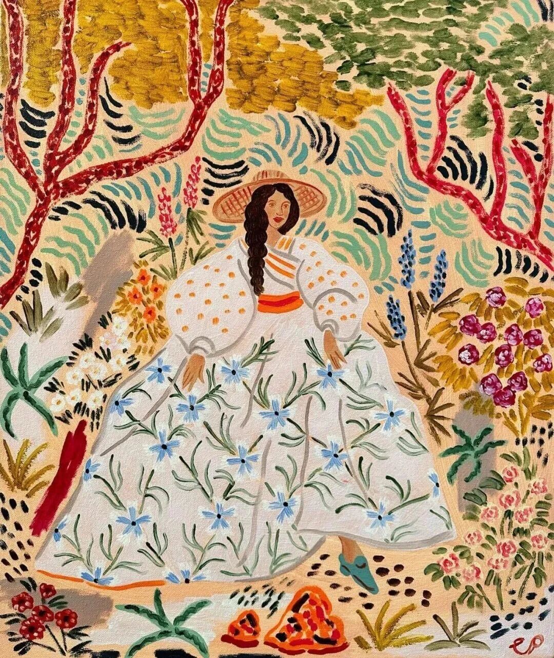
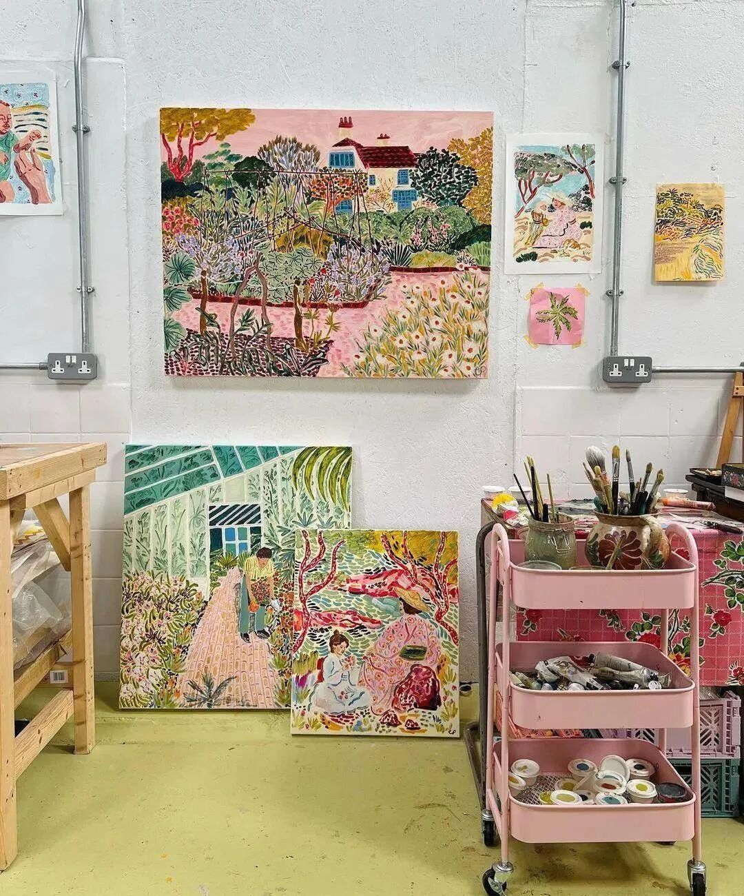
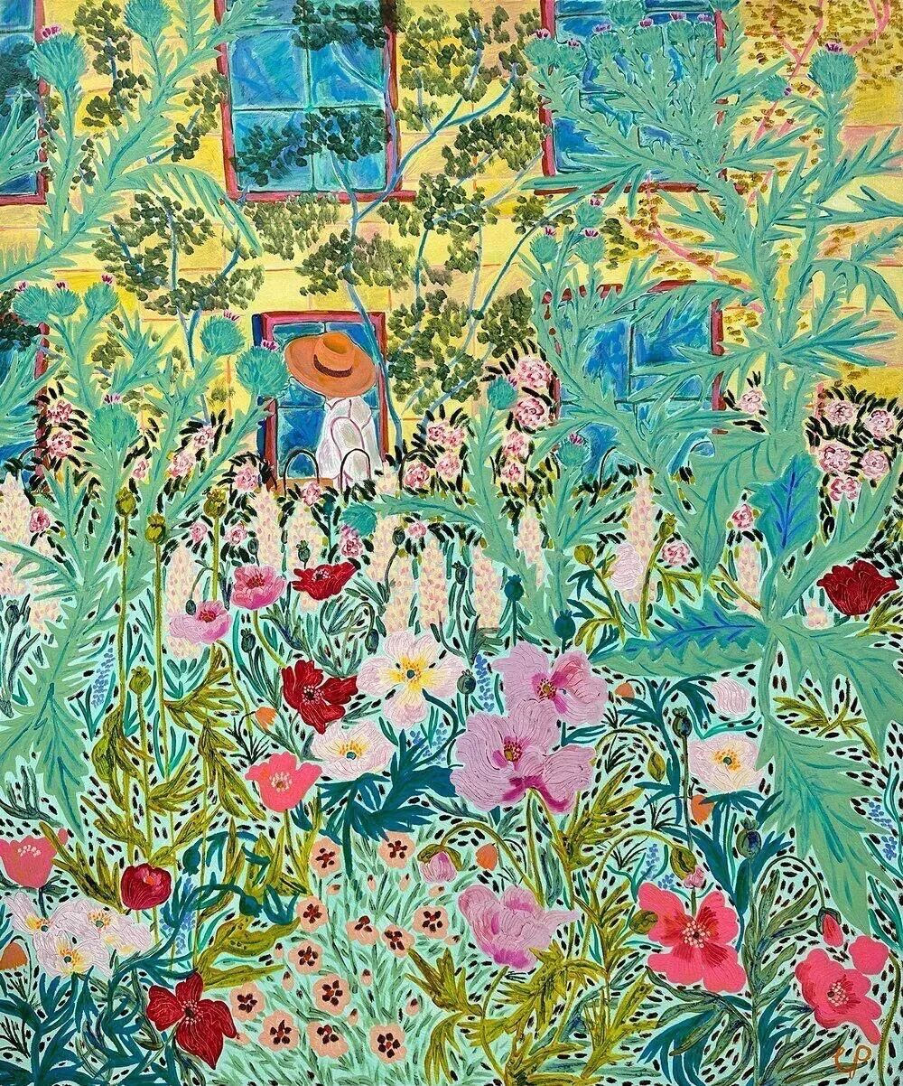
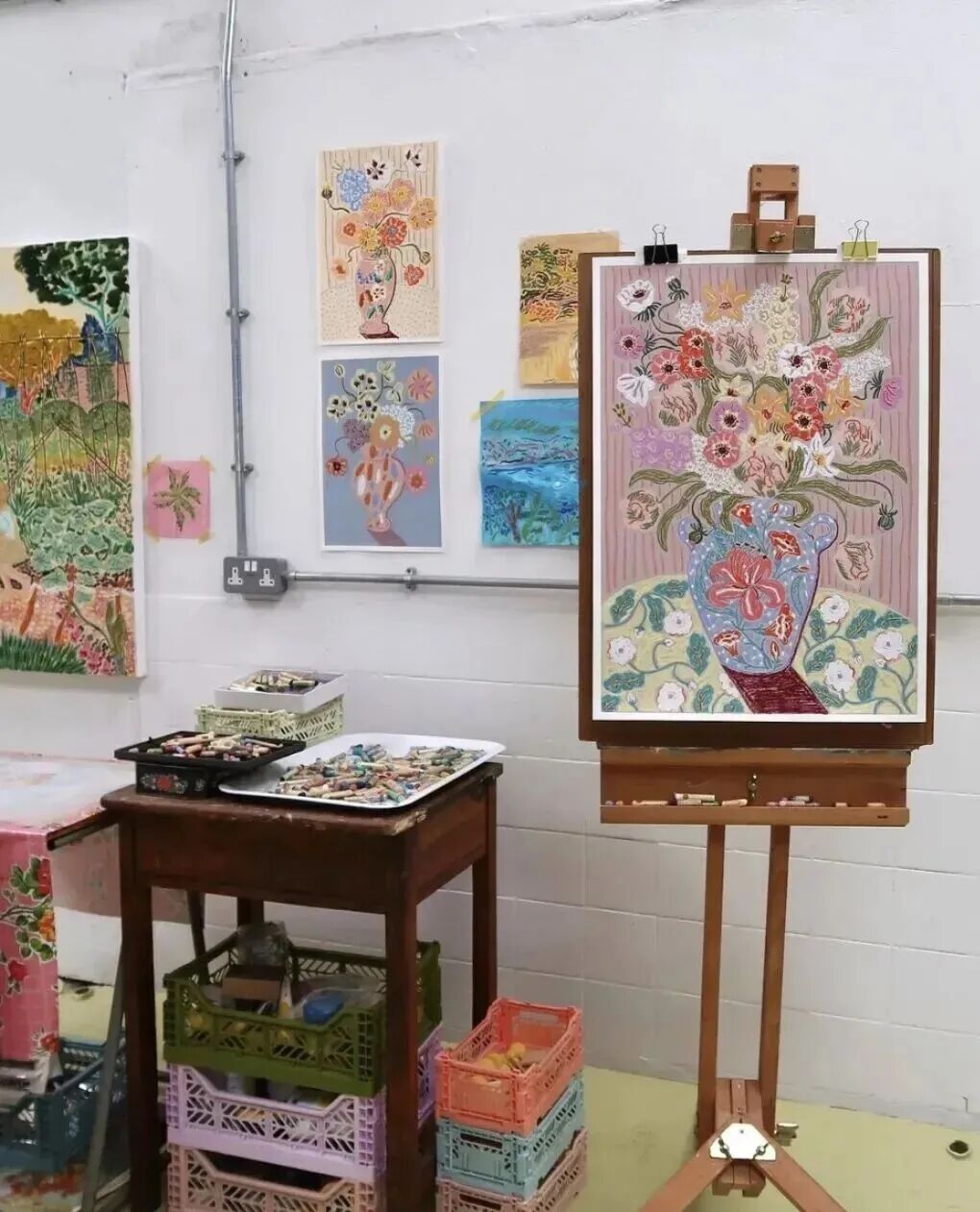
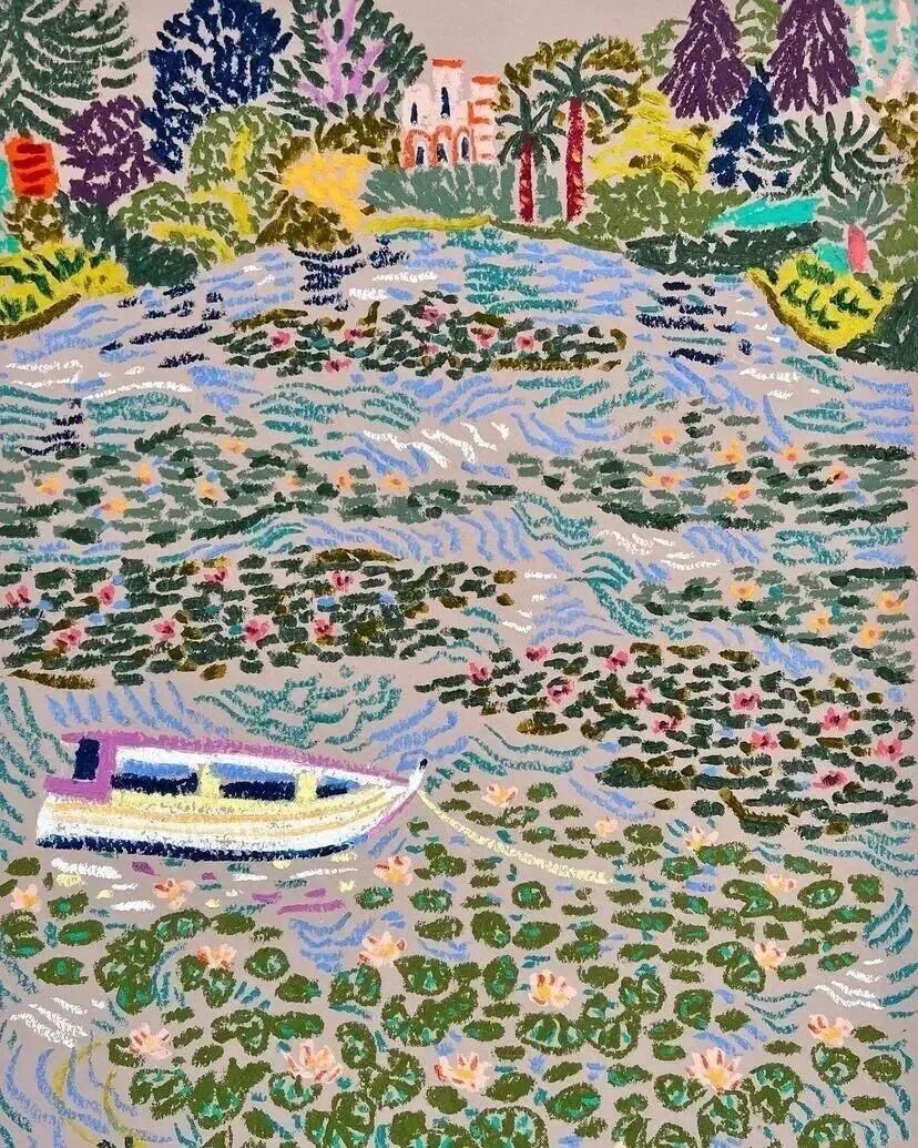
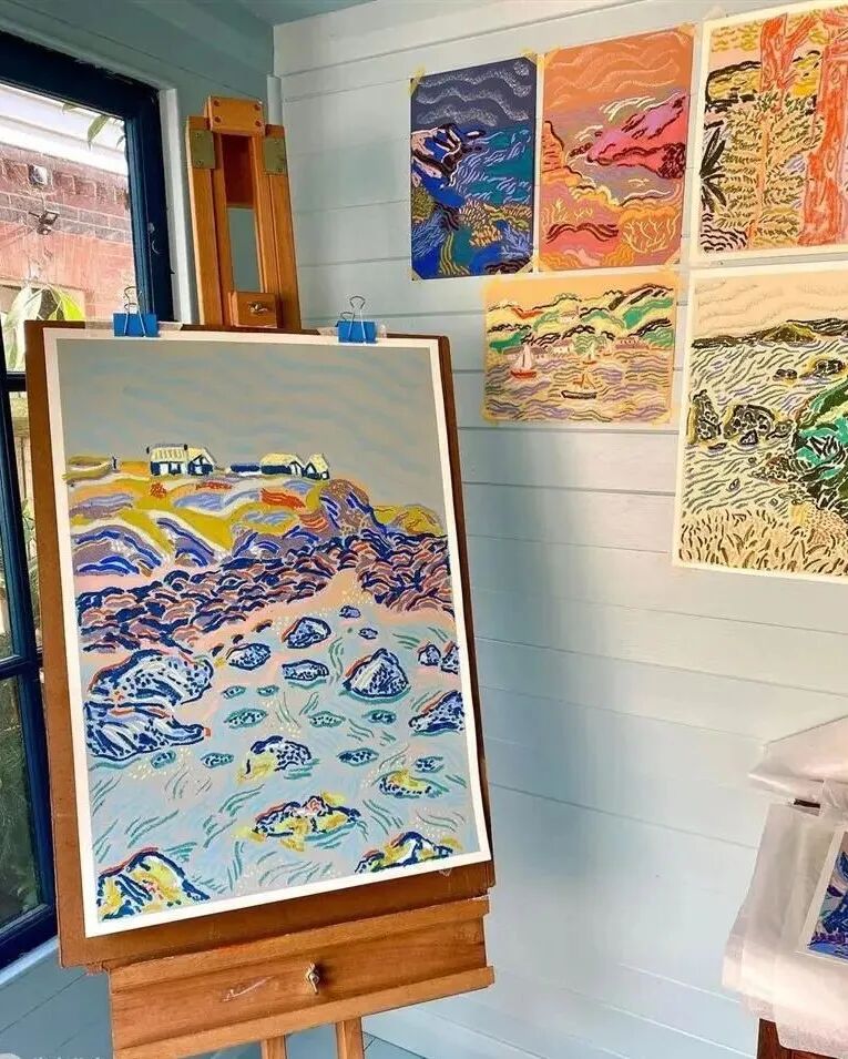
2012 年,卡米拉从威斯敏斯特大学毕业,正式开启插画师生涯。但她的艺术风格并非一蹴而就,而是在多元影响下逐渐成型:童年读过的中世纪儿童绘本,让她迷上了简洁而富有童趣的线条;世界各地的复古纺织品,为她提供了装饰性图案的创作灵感;而后印象派的厚涂笔触与野兽派的大胆用色,则让她挣脱了传统插画的桎梏,形成了“既狂野又温柔”的独特表达。
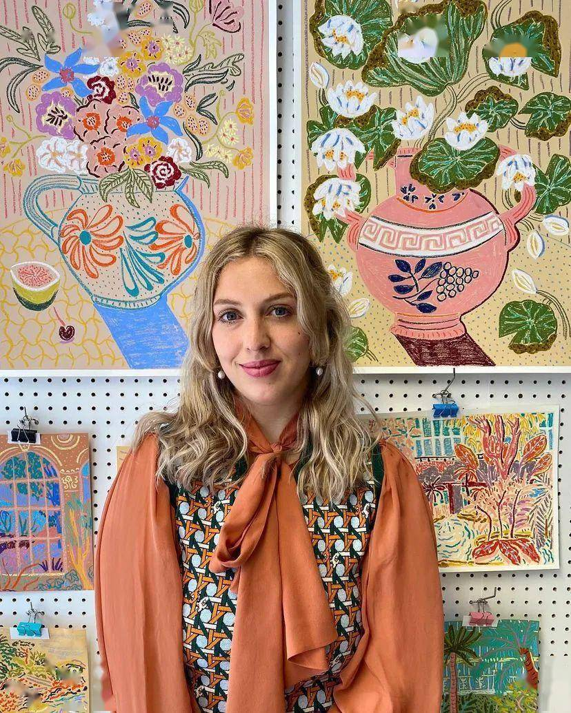
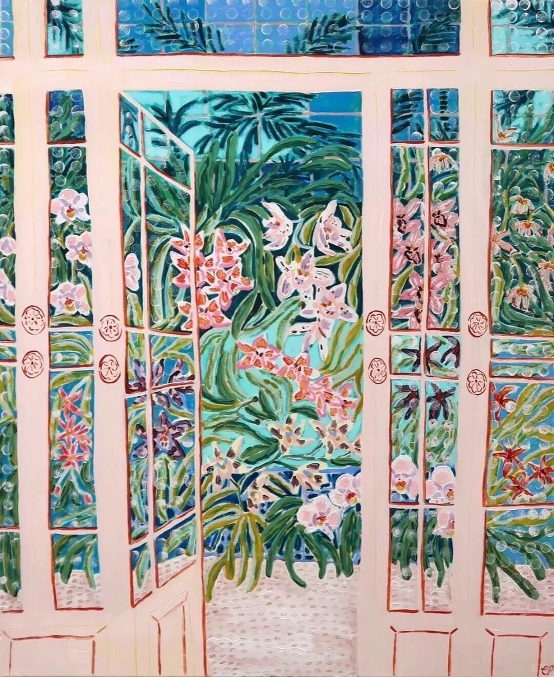
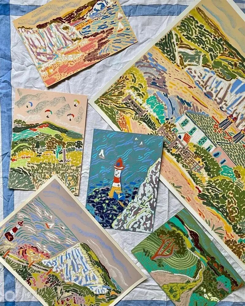
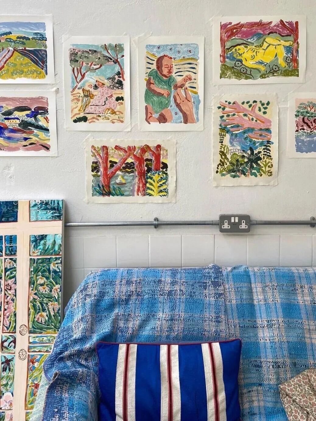
值得一提的是,卡米拉的创作始终保持着“直觉先行” 的纯粹 —— 她从不进行草稿勾勒,而是凭借对色彩与形状的敏锐感知,直接用画笔在画布上探索。这种即兴创作的方式,让她的作品充满了灵动的生命力,每一笔都带着情绪的流动,每一种色彩搭配都藏着不期而遇的惊喜。
02 风格解谜:读懂她的色彩魔法

卡米拉的作品有着极高的辨识度,哪怕只是惊鸿一瞥,也能瞬间被其独特的视觉语言打动。
1. 色彩:高饱和的情绪风暴
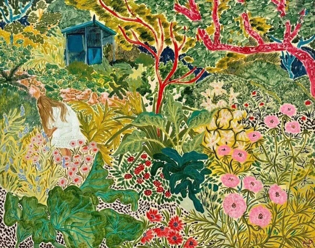
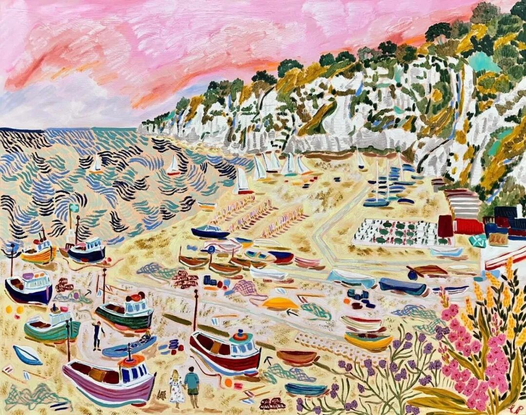
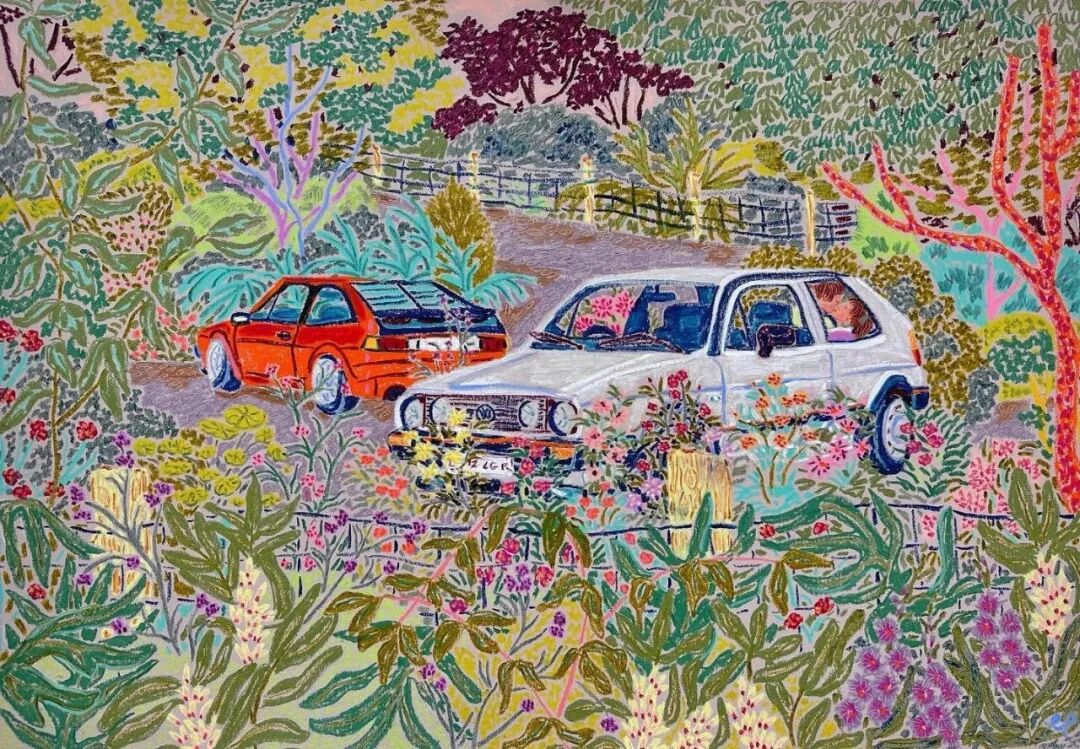
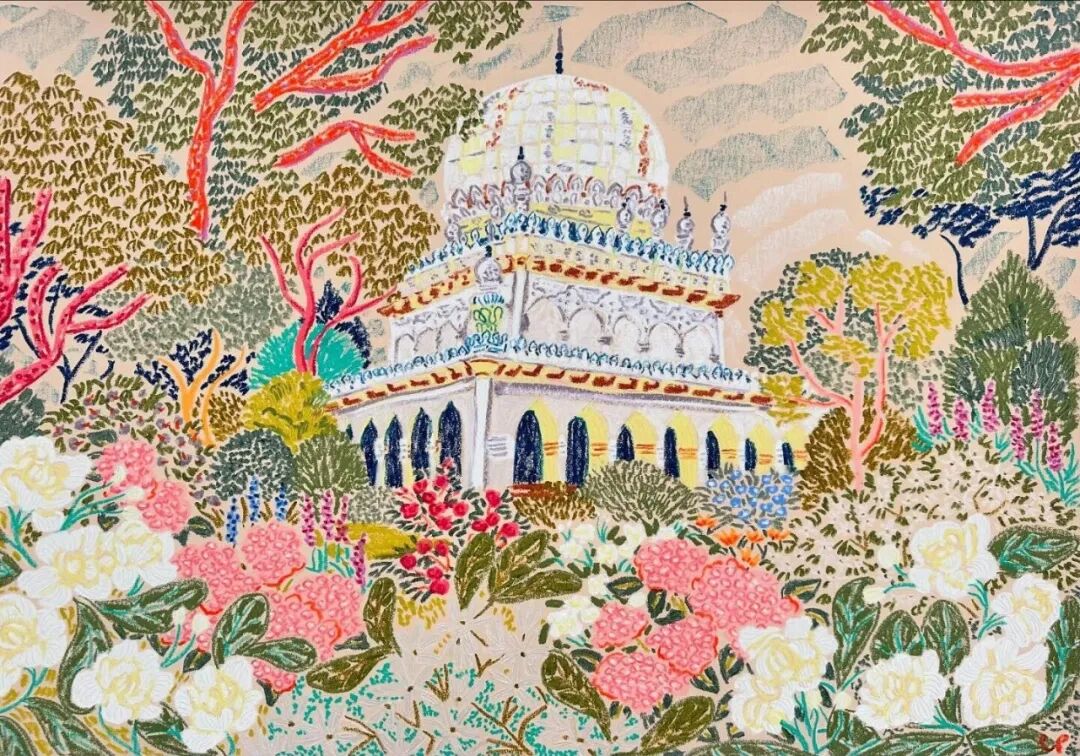
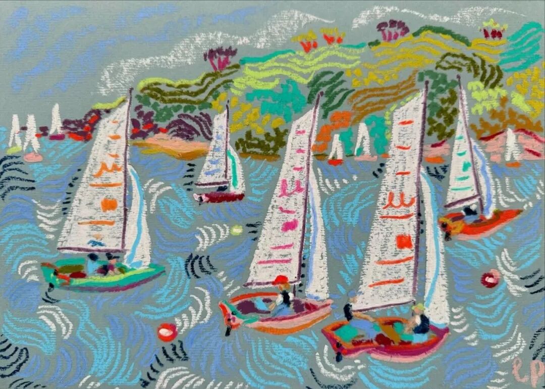
卡米拉的色彩运用,堪称一场大胆的视觉狂欢。她拒绝沉闷的色调,偏爱桃红、柠黄、靛蓝、翠绿等高饱和度色彩,将它们毫无顾忌地碰撞、叠加,形成强烈的视觉冲击。
卡米拉认为,明亮的色彩能唤醒人们深藏心底的温暖记忆—— 童年的糖果、海边的日出、花园里的派对,这些美好瞬间都与鲜明的色彩绑定在一起。因此,她的画不仅是视觉的享受,更是情绪的催化剂,能让观者在缤纷色彩中卸下疲惫,重拾对生活的热忱。
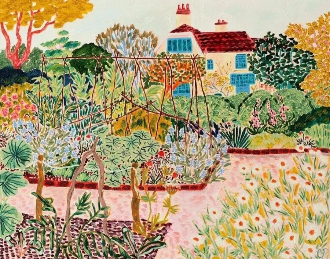
2. 笔触:粗粝中的温柔质感
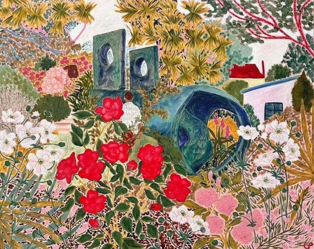
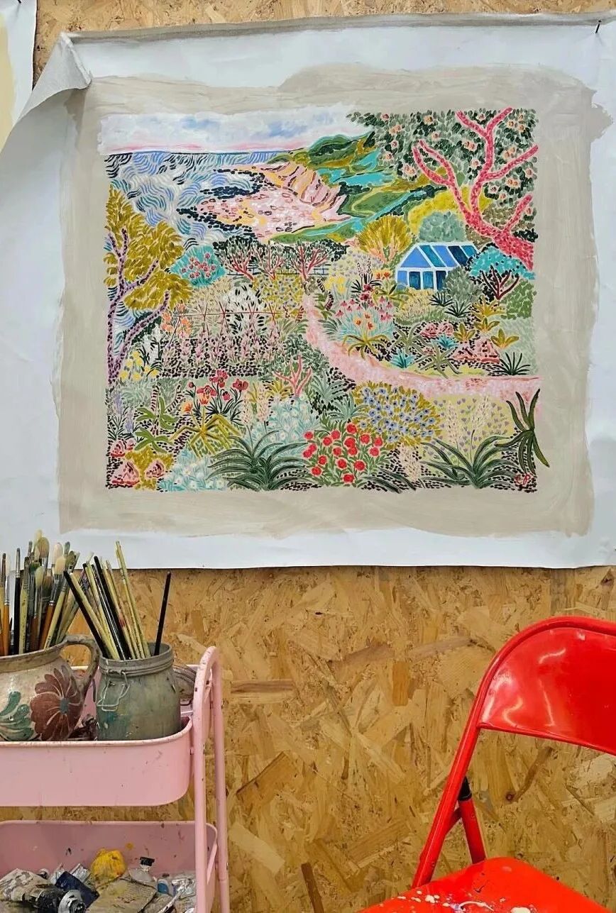
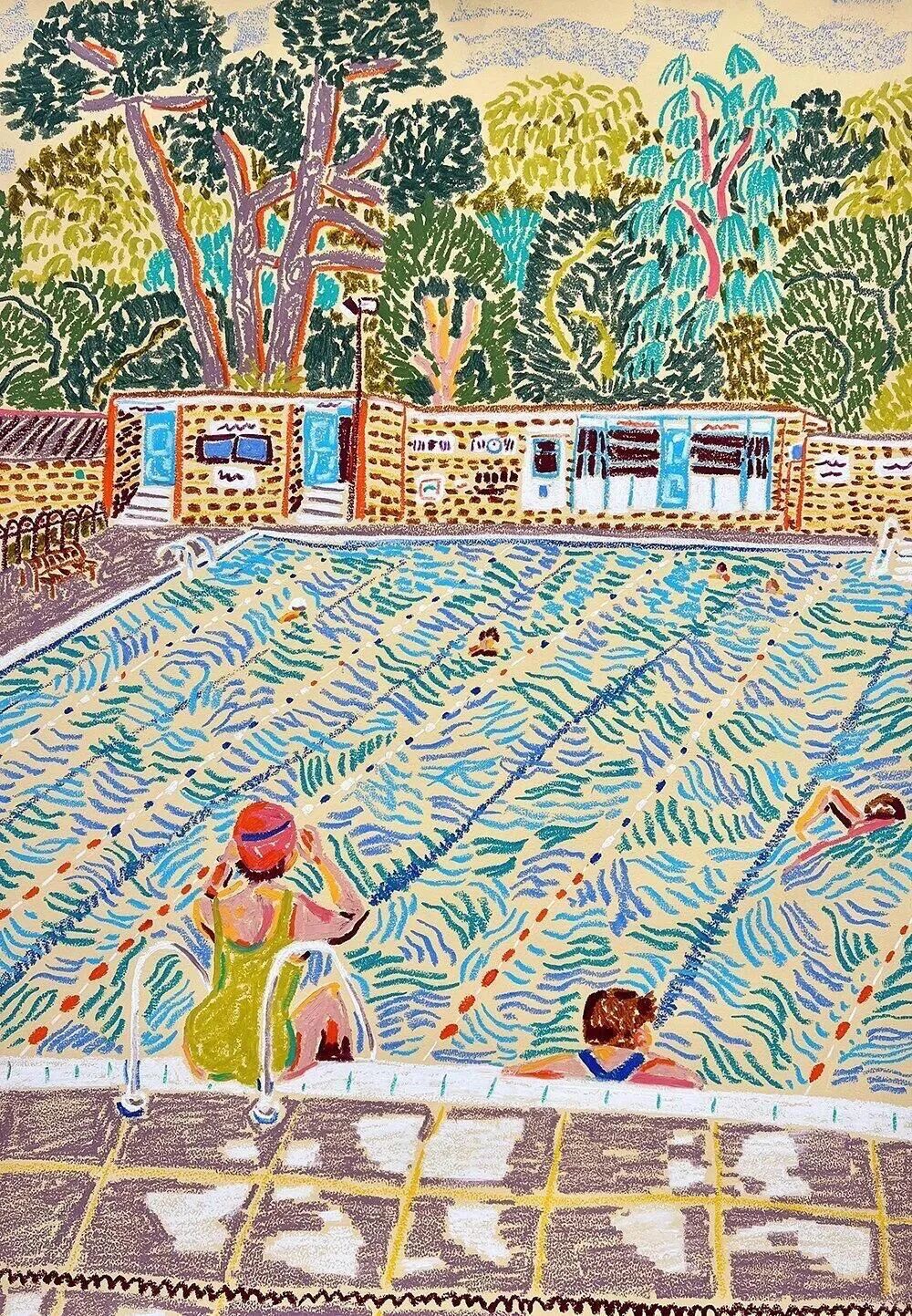
卡米拉偏爱油画棒与马克笔结合的创作方式,厚且可见的笔触是她的标志性特征。她的笔触大胆而动态,有时是粗犷的线条勾勒轮廓,有时是细腻的点线填充细节,粗粝中带着温柔,力量中藏着诗意。在描绘花卉时,她用短促的笔触表现花瓣的层次,用密集的点画模拟花蕊的质感;在刻画人物时,她则用流畅的线条勾勒姿态,用轻柔的笔触晕染情绪,让画面充满肌理感与呼吸感。
这种笔触风格,既继承了后印象派的艺术传统,又融入了现代插画的灵动活泼。
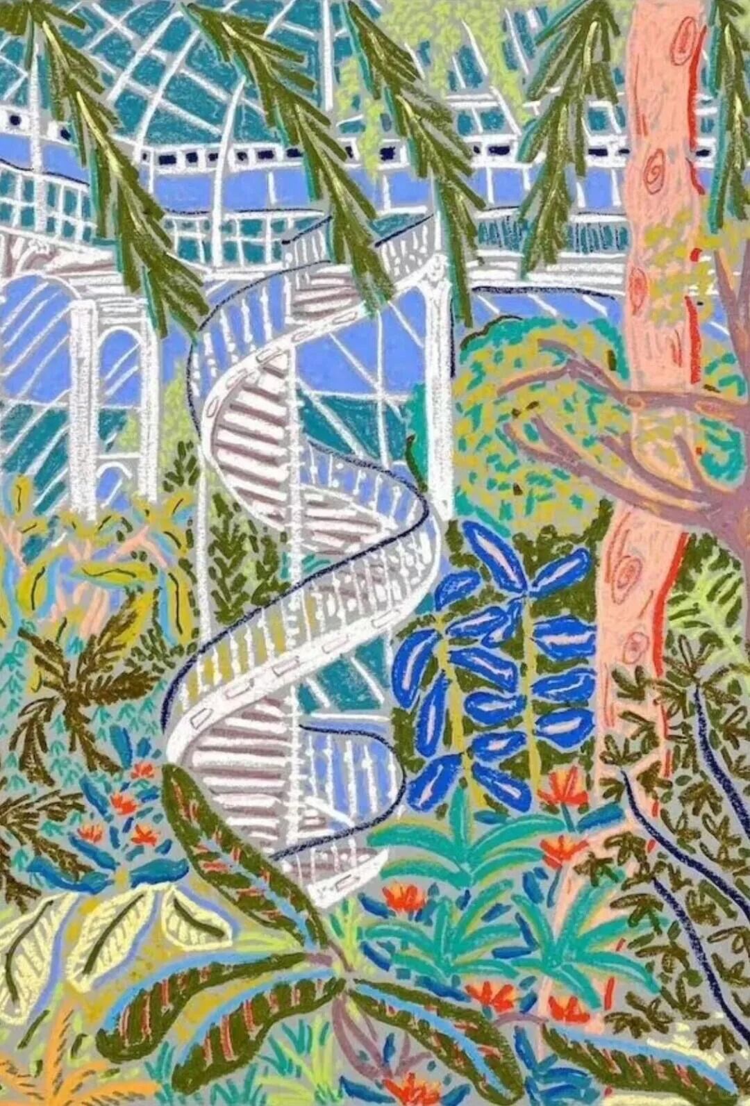
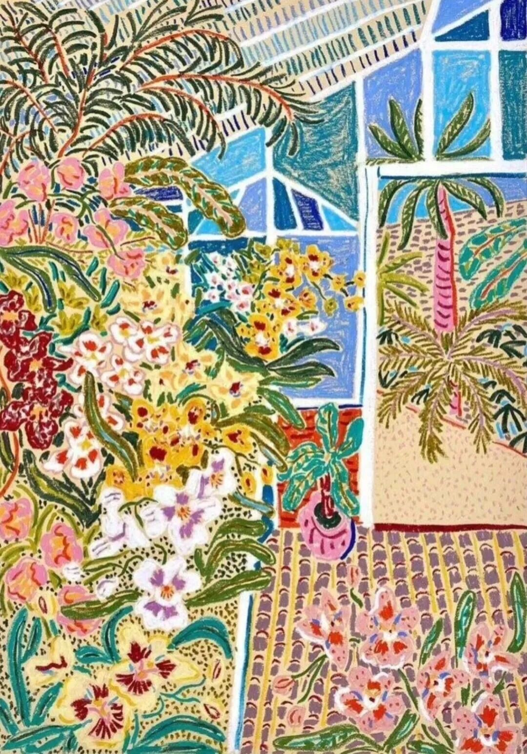
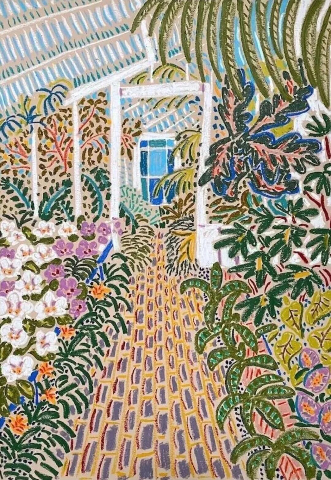
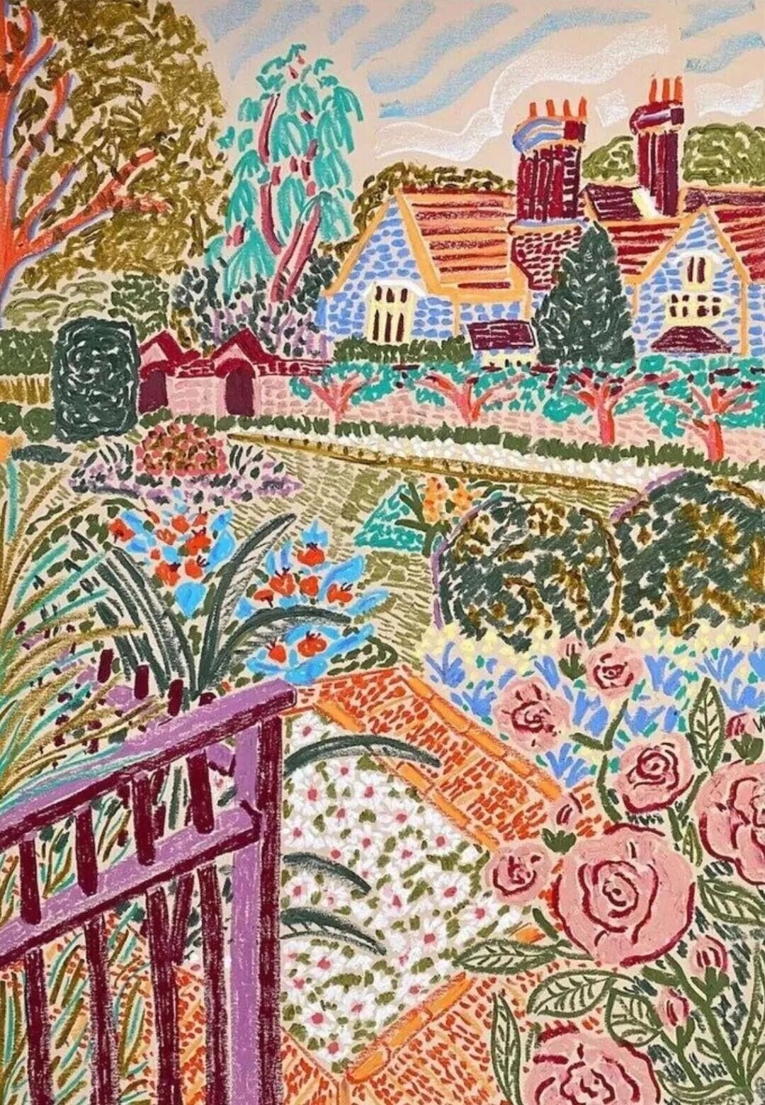
3. 构图:版画式的装饰美学
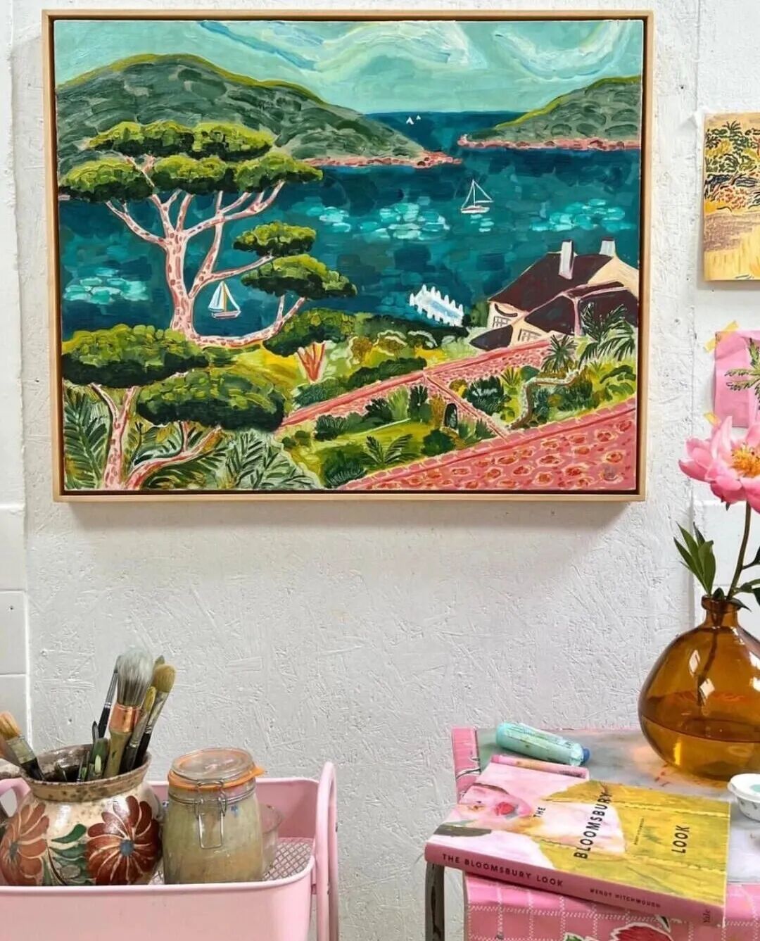
卡米拉的作品极具装饰意味,这得益于她对版画手法的巧妙运用。她将画面中的元素抽象化处理,用简洁的几何形状搭建框架,再用点、线、面的组合填充细节,就像搭积木一样,让画面既有层次又有节奏。
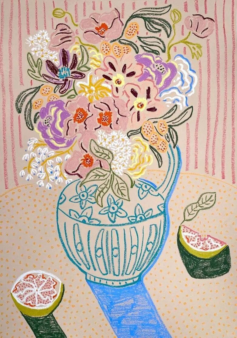
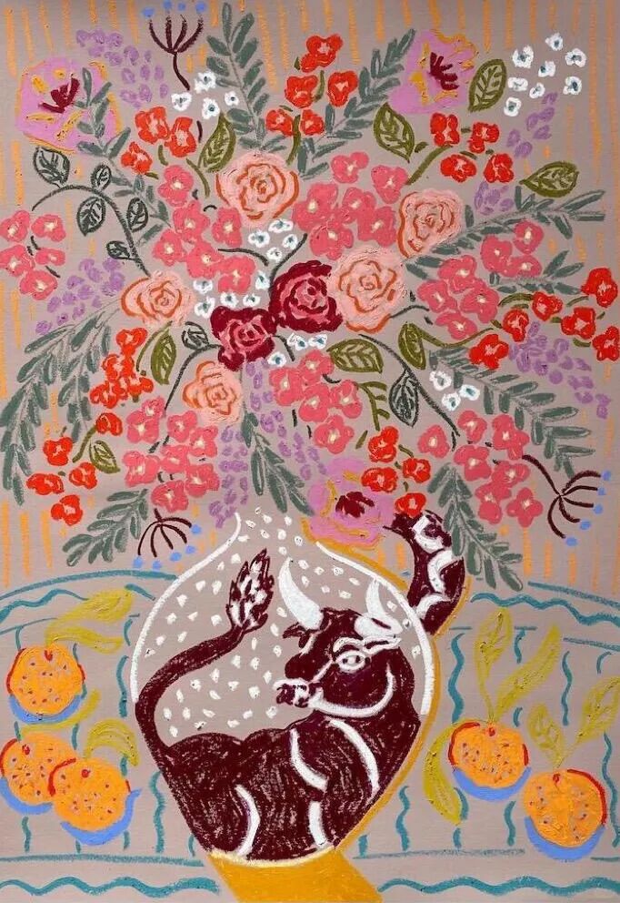
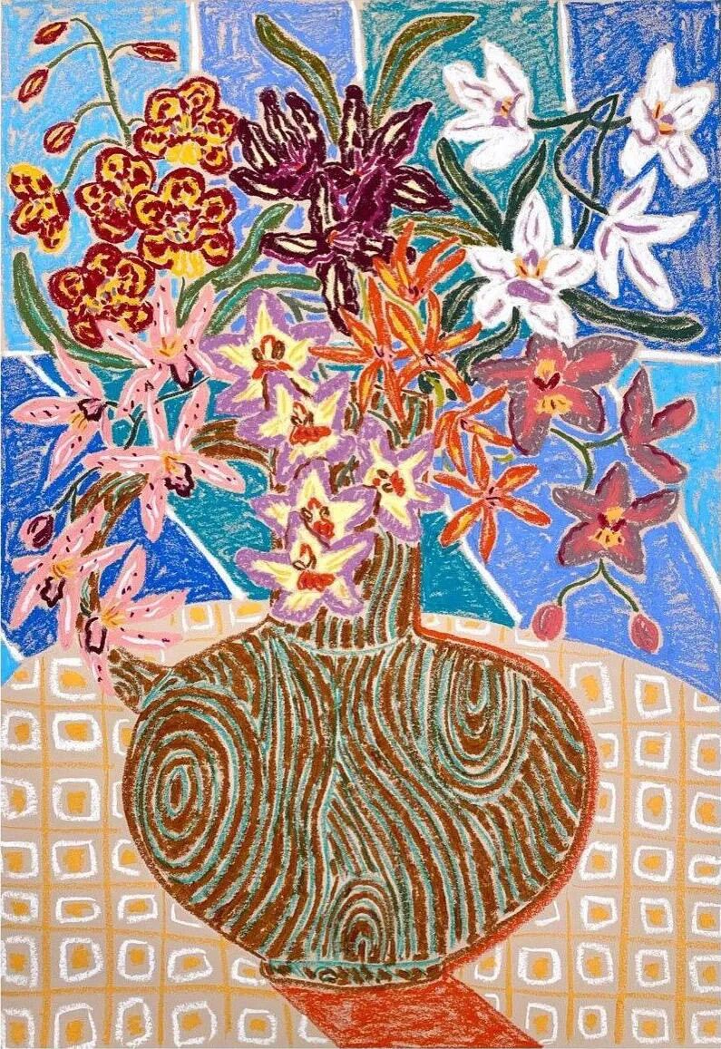
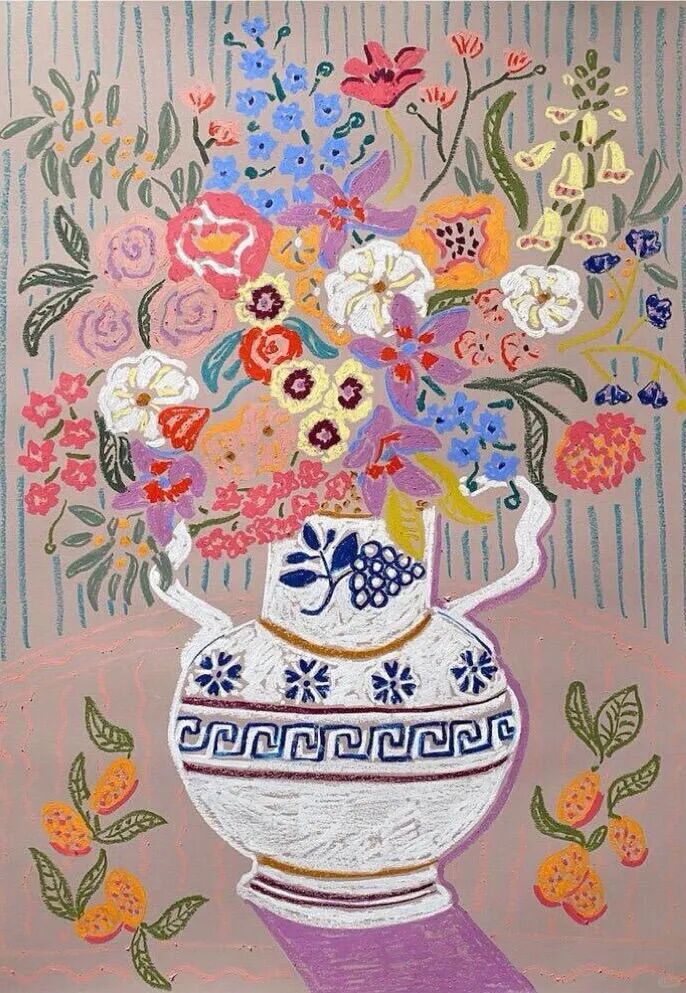
此外,她还擅长利用画面的负空间,让留白与图案形成巧妙呼应,避免视觉拥挤。这种构图方式,让她的作品既适合展览陈列,也适配杂志、书籍、家居装饰等多种场景,这也是她深受商业品牌青睐的重要原因。
4. 主题:生活与温情的诗意表达
卡米拉的创作主题始终围绕“生活” 展开,花卉、静物、家庭场景、自然风光都是她的灵感来源。平凡的场景在她的笔下,都变成了充满诗意的画面。
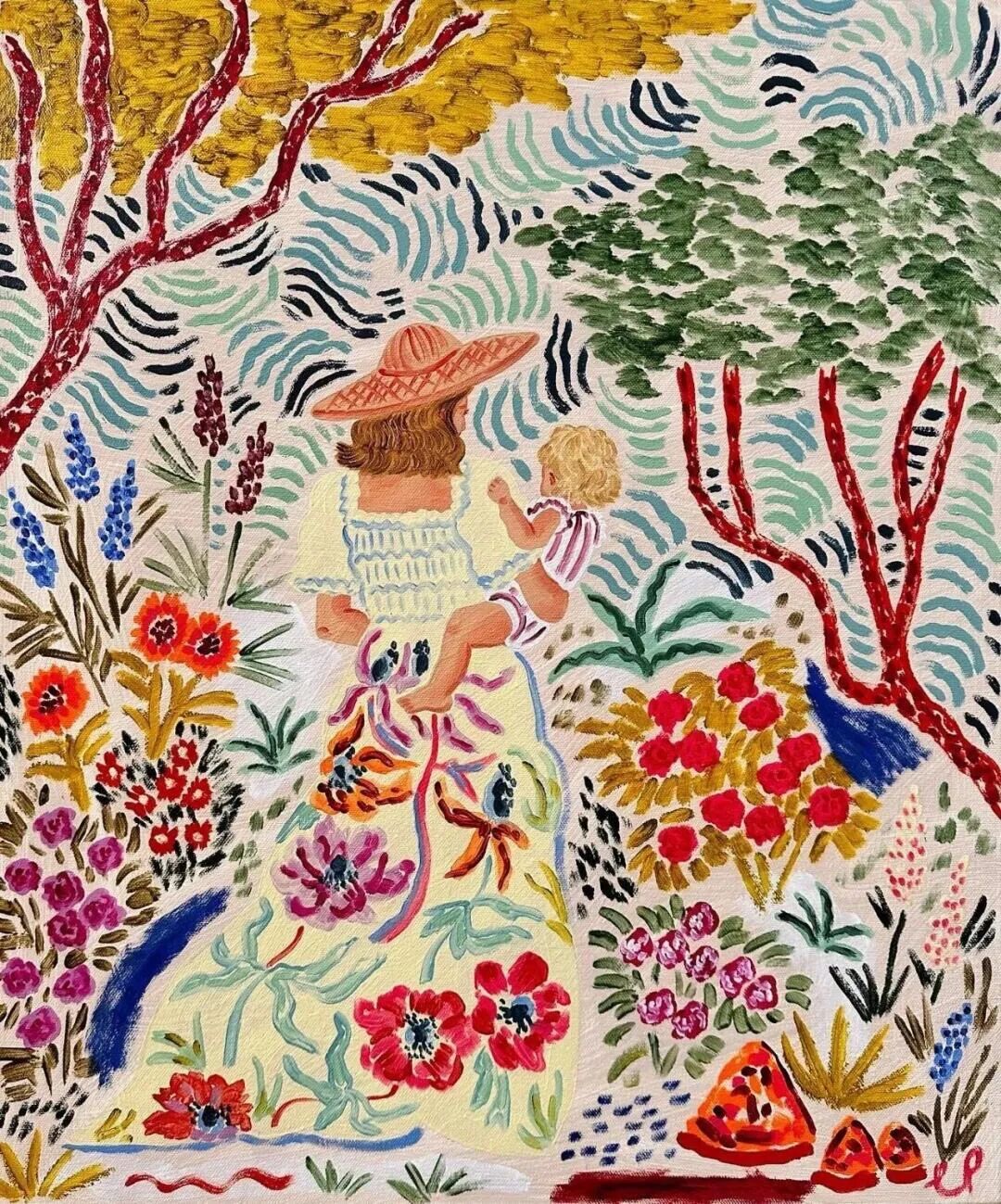
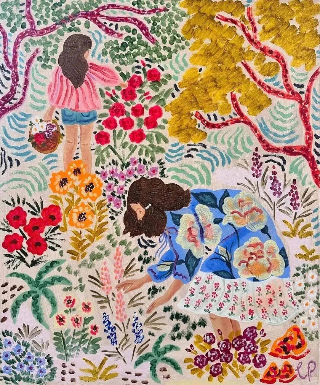
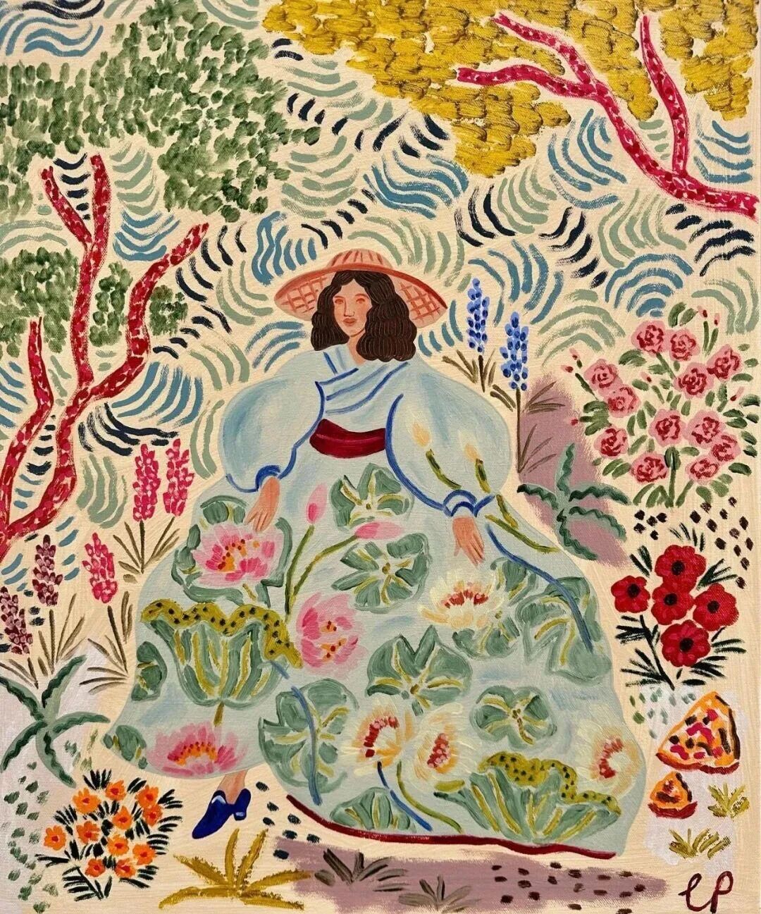
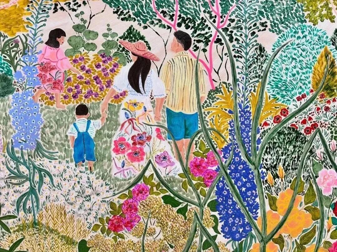
其中,“女性与家庭的羁绊” 是她反复探索的核心主题。她用缠绕生长的花卉隐喻母女间的亲密关系,花朵相互依偎、藤蔓彼此缠绕,就像母女之间无法割舍的情感纽带。作为一名两个年幼女儿的母亲,家庭生活是她幸福感的重要来源,也自然流入她的画布。
03 商业与艺术:让美好走进日常
卡米拉的艺术魅力,不仅在于画廊中的展览,更在于她让艺术真正走进了普通人的生活。从毕业至今,她的作品已广泛应用于杂志、书籍、食品、家居等多个领域,与可口可乐、苹果、谷歌、三星、祖马龙等全球知名品牌达成合作,成为商业与艺术完美融合的典范。
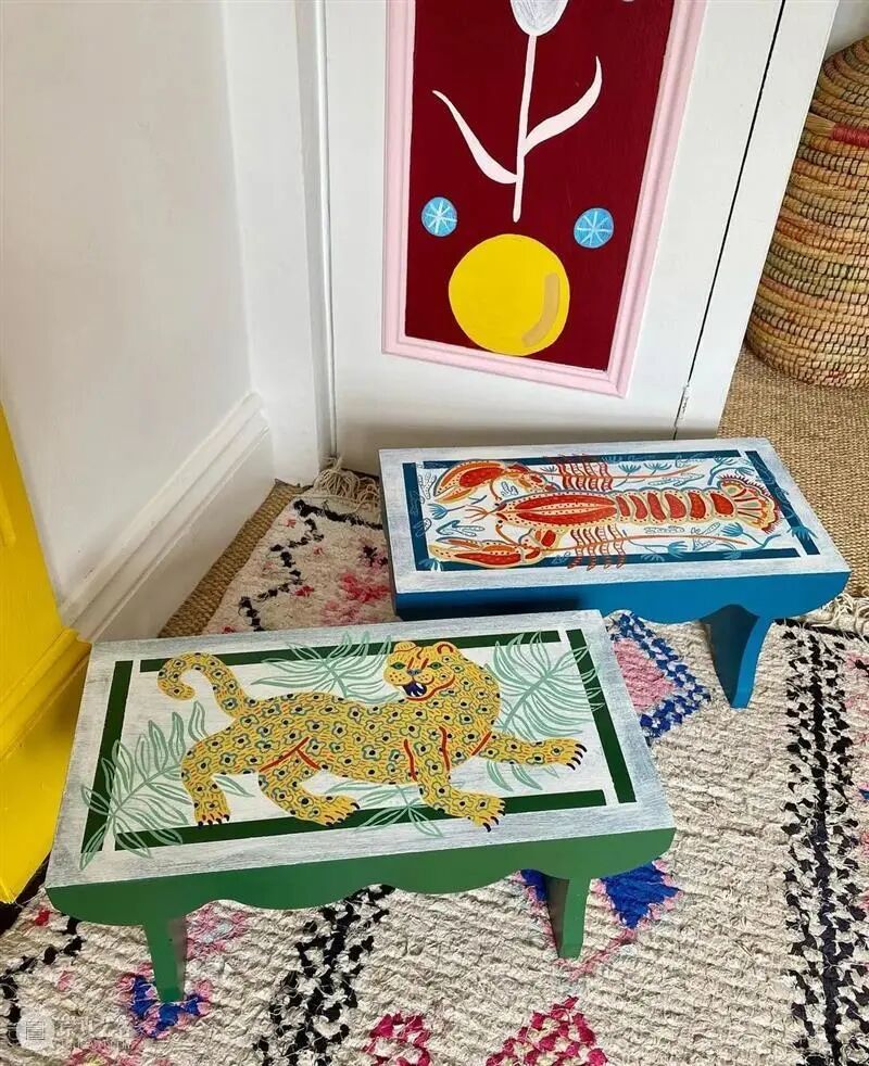
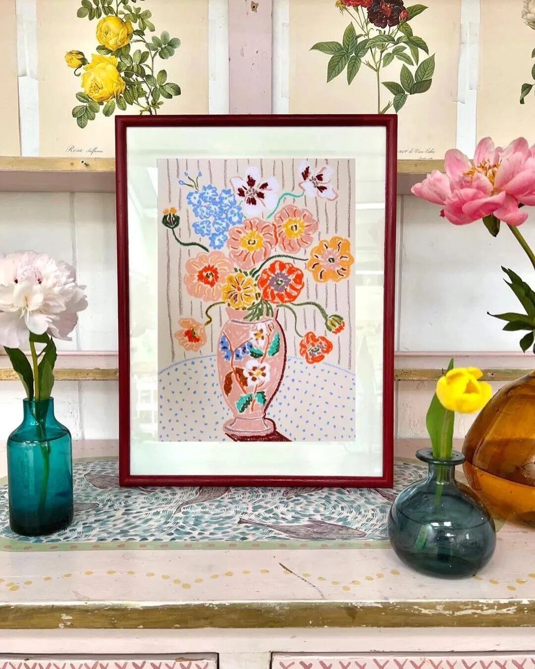
此外,她还与丈夫合作涉足家居用品领域,将自己的画作手绘在家具上,打造独一无二的艺术家居,让人们在日常生活中就能感受艺术的美好。这种“艺术生活化”的理念,让卡米拉的影响力远超艺术圈。她的作品不再是遥不可及的收藏品,而是能融入日常的实用美学。
04 对话自然:用艺术守护濒危物种
除了视觉上的享受,卡米拉·帕金斯的作品还藏着一份沉甸甸的责任感——对自然的热爱与环保。
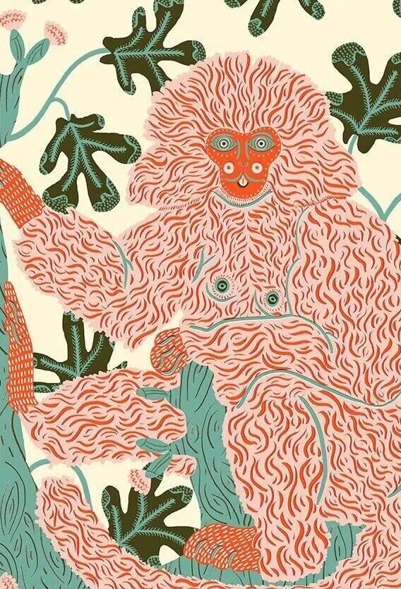
她曾深入参与到“灭绝俱乐部”的项目中,为那些已经灭绝或极度濒危的物种创作插画。这些动物在现实生活中我们可能永远无法见到,但在卡米拉的画笔下,它们重新获得了生命,以一种鲜艳、活泼、充满希望的姿态呈现在世人面前。
对于家长来说,这是绝佳的自然教育素材。带着孩子看卡米拉的画,不仅仅是看图说话,更是一场关于“生命多样性”的对话。通过艺术,在孩子心中种下敬畏自然、保护地球的种子,这比生硬的说教要有力得多。
05 结语:把生活染成喜欢的色彩
如今,卡米拉的作品已在萨默塞特府和V&A博物馆这样的重量级机构展出。她的艺术世界仍在不断生长,如同她画笔下的花园。
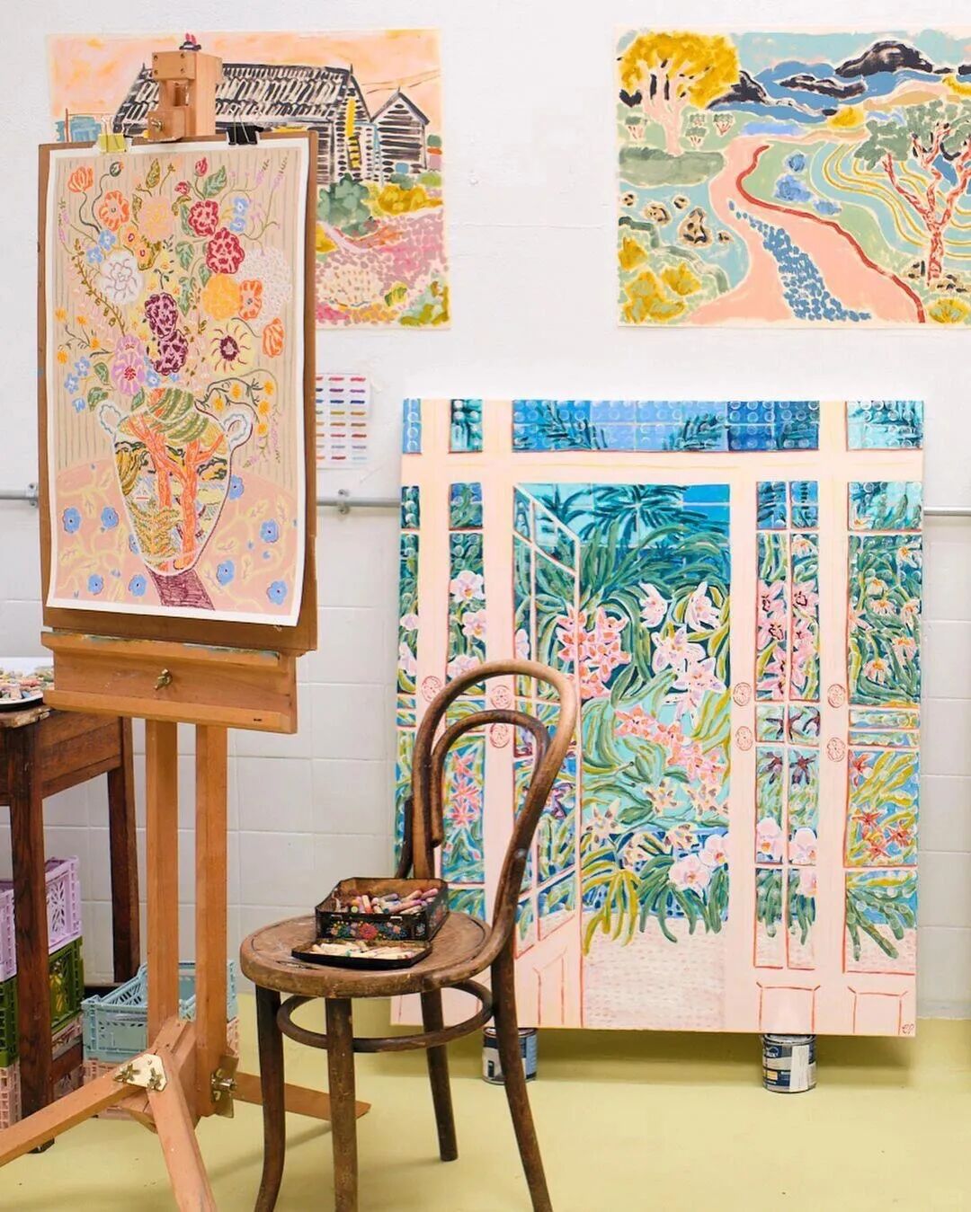
在信息过载、焦虑常伴的时代,卡米拉·帕金斯用最饱和的色彩和最诚挚的笔触,为我们保留了一条通往简单快乐的秘密路径。推开她那扇色彩斑斓的窗,里面永远收藏着一个阳光正好的夏天。
If you have ever seen the paintings of Camilla Perkins, you must have been struck by the vitality that bursts toward you: peach pink shattering the silence of indigo, lemon yellow igniting the breath of emerald green, and rough brushstrokes like the fingerprints of wind, fermenting flowers, still life, and everyday moments into a sparkling glass of summer fruit soda.
This illustrator from East Sussex, England, uses the whispers of oil pastels and markers to break the boundary between reality and dreams, turning each work into a colorful sanctuary that heals the soul. Her paintings are not only a visual feast but also an enlightenment about color, passion, and life—telling us that the world is meant to be this vibrant, and painting is meant to be this joyful.
01 Artistic Origins: The Winds of East Sussex That Brought the Inspiration of Color
Camilla Perkins’ artistic roots are deeply grounded in the land of East Sussex, England. This historic county in southeast England, with its long coastline, rich countryside, and ever-present rainy seasons, offers endless inspiration through the saltiness of the sea, the fragrance of gardens, and the tranquility of rural life.
Camilla’s artistic awakening began with a childhood encounter at a museum. When she was a child, her mother took her to see a textile exhibition by Henri Matisse. Those bold, pure colors and patterns struck her like lightning, allowing her to truly feel for the first time that color itself possesses the power to touch the soul and evoke strong emotions.
In 2012, Camilla graduated from the University of Westminster and officially began her career as an illustrator. However, her artistic style did not form overnight but gradually evolved under diverse influences: medieval children’s books she read in childhood sparked her love for simple yet playful lines; vintage textiles from around the world inspired her decorative patterns; and the thick brushstrokes of Post-Impressionism and the bold colors of Fauvism freed her from the constraints of traditional illustration, shaping her unique expression that is “both wild and gentle.”
Notably, Camilla’s creative process has always maintained the purity of “intuition first.” She never makes preliminary sketches but instead relies on her keen sensitivity to color and shape, exploring directly on the canvas with her brush. This improvisational approach fills her works with vibrant life, where every stroke carries emotional flow and every color combination holds unexpected surprises.
02 Decoding Her Style: Understanding Her Magic of Color
Camilla’s works are highly recognizable—even a brief glance is enough to be captivated by her unique visual language.
1. Color: A High-Saturation Emotional Storm
Camilla’s use of color can be described as a bold visual carnival. She rejects dull tones and prefers highly saturated colors such as peach pink, lemon yellow, indigo, and emerald green, allowing them to collide and overlap freely to create strong visual impact.
She believes that bright colors can awaken warm memories hidden deep within people—childhood candies, seaside sunrises, garden parties. These beautiful moments are bound to vivid colors. Therefore, her paintings are not only visually enjoyable but also emotional catalysts that help viewers release fatigue and rediscover their passion for life.
2. Brushstrokes: Gentle Texture Within Roughness
Camilla prefers combining oil pastels and markers, with thick, visible strokes as her signature feature. Her brushwork is bold and dynamic—sometimes rough lines outline forms, sometimes delicate dots and lines fill details—blending roughness with tenderness and strength with poetry.
When depicting flowers, she uses short strokes to express layered petals and dense dots to simulate the texture of stamens. When portraying people, she uses flowing lines to define posture and soft strokes to convey emotion, filling the image with texture and breath.
This brushstroke style inherits the artistic tradition of Post-Impressionism while incorporating the liveliness of modern illustration.
3. Composition: Print-Like Decorative Aesthetics
Camilla’s works carry strong decorative qualities, thanks to her skillful use of printmaking techniques. She abstracts elements into simple geometric shapes to build structure, then fills details with combinations of points, lines, and planes—like building blocks—creating rhythm and depth.
She also makes skillful use of negative space, allowing blank areas to interact harmoniously with patterns and prevent visual overcrowding. This compositional style makes her work suitable not only for gallery exhibitions but also for magazines, books, and home décor, which is one reason she is favored by commercial brands.
4. Themes: Poetic Expressions of Life and Warmth
Camilla’s themes always revolve around life. Flowers, still life, family scenes, and natural landscapes are all sources of inspiration. Ordinary scenes become poetic images under her brush.
Among them, “the bond between women and family” is a recurring core theme. She uses intertwined flowers as metaphors for the intimacy between mothers and daughters—blooms leaning on each other and vines wrapping together, like inseparable emotional ties. As a mother of two young daughters, family life is a major source of her happiness and naturally flows into her canvas.
03 Commerce and Art: Bringing Beauty into Everyday Life
Camilla’s artistic charm exists not only in galleries but also in everyday life. Since graduating, her works have been widely applied in magazines, books, food products, and home goods. She has collaborated with globally renowned brands such as Coca-Cola, Apple, Google, Samsung, and Jo Malone, becoming a model of the perfect fusion of commerce and art.
She has also collaborated with her husband in the home goods field, hand-painting her artwork onto furniture to create unique artistic home pieces, allowing people to experience art in daily life. This philosophy of “art integrated into life” has extended her influence far beyond the art world. Her works are no longer distant collectibles but practical aesthetics that can be lived with.
04 Dialogue with Nature: Protecting Endangered Species Through Art
Beyond visual enjoyment, Camilla Perkins’ works also carry a deep sense of responsibility—a love for nature and environmental protection.
She participated in the “Extinction Club” project, creating illustrations for species that are extinct or critically endangered. Though these animals may never be seen in real life, they are given new life through her brush, presented in vivid, lively, and hopeful forms.
For parents, this is excellent material for nature education. Viewing her works with children becomes not just looking at pictures but a dialogue about biodiversity. Through art, seeds of respect for nature and protection of the Earth are planted in children’s hearts—far more powerful than rigid instruction.
05 Conclusion: Dye Life in the Colors You Love
Today, Camilla’s works have been exhibited in prestigious institutions such as Somerset House and the V&A Museum. Her artistic world continues to grow, like the garden in her paintings.
In an era of information overload and constant anxiety, Camilla Perkins preserves a secret path to simple happiness through her most saturated colors and most sincere brushstrokes. Open her vibrant window, and inside there will always be a summer filled with perfect sunshine.